Data visualization with Matplotlib
Questions
What happens if you can’t automatically produce plots?
When to use Matplotlib for data visualization?
When to prefer other libraries?
Objectives
Be able to create simple plots with Matplotlib and tweak them
Know about object-oriented vs pyplot interfaces of Matplotlib
Be able to adapt gallery examples
Know how to look for help
Know that other tools exist
Repeatability/reproducibility
From Claus O. Wilke: “Fundamentals of Data Visualization”:
One thing I have learned over the years is that automation is your friend. I think figures should be autogenerated as part of the data analysis pipeline (which should also be automated), and they should come out of the pipeline ready to be sent to the printer, no manual post-processing needed.
Try to minimize manual post-processing. This could bite you when you need to regenerate 50 figures one day before submission deadline or regenerate a set of figures after the person who created them left the group.
There is not the one perfect language and not the one perfect library for everything.
Within Python, many libraries exist:
Matplotlib: probably the most standard and most widely used
Seaborn: high-level interface to Matplotlib, statistical functions built in
Vega-Altair: declarative visualization, statistics built in (we have an entire lesson about data visualization using Vega-Altair)
Plotly: interactive graphs
Bokeh: also here good for interactivity
plotnine: implementation of a grammar of graphics in Python, it is based on ggplot2
ggplot: R users will be more at home
PyNGL: used in the weather forecast community
K3D: Jupyter Notebook extension for 3D visualization
…
Two main families of libraries: procedural (e.g. Matplotlib) and declarative.
Why are we starting with Matplotlib?
Matplotlib is perhaps the most popular Python plotting library.
Many libraries build on top of Matplotlib (example: Seaborn).
MATLAB users will feel familiar.
Even if you choose to use another library (see above list), chances are high that you need to adapt a Matplotlib plot of somebody else.
Libraries that are built on top of Matplotlib may need knowledge of Matplotlib for custom adjustments.
However it is a relatively low-level interface for drawing (in terms of abstractions, not in terms of quality) and does not provide statistical functions. Some figures require typing and tweaking many lines of code.
Many other visualization libraries exist with their own strengths, it is also a matter of personal preferences.
Getting started with Matplotlib
We can start in a Jupyter Notebook since notebooks are typically a good fit for data visualizations. But if you prefer to run this as a script, this is also OK.
Let us create our first plot using
subplots(),
scatter, and some other methods on the
Axes object:
import matplotlib.pyplot as plt

# this is dataset 1 from
# https://en.wikipedia.org/wiki/Anscombe%27s_quartet
data_x = [10.0, 8.0, 13.0, 9.0, 11.0, 14.0, 6.0, 4.0, 12.0, 7.0, 5.0]
data_y = [8.04, 6.95, 7.58, 8.81, 8.33, 9.96, 7.24, 4.26, 10.84, 4.82, 5.68]

fig, ax = plt.subplots()

ax.scatter(x=data_x, y=data_y, c="#E69F00")

ax.set_xlabel("we should label the x axis")
ax.set_ylabel("we should label the y axis")
ax.set_title("some title")

# uncomment the next line if you would like to save the figure to disk
# fig.savefig("my-first-plot.png")
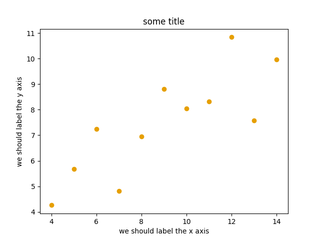
This is the result of our first plot.
When running a Matplotlib script on a remote server without a
“display” (e.g. compute cluster), you may need to add the
matplotlib.use call:
import matplotlib.pyplot as plt
matplotlib.use("Agg")

# ... rest of the script
Exercise: Matplotlib
Exercise Matplotlib-1: extend the previous example (15 min)
Extend the previous plot by also plotting this set of values but this time using a different color (
#56B4E9):# this is dataset 2 data2_y = [9.14, 8.14, 8.74, 8.77, 9.26, 8.10, 6.13, 3.10, 9.13, 7.26, 4.74]
Then add another color (
#009E73) which plots the second dataset, scaled by 2.0.# here we multiply all elements of data2_y by 2.0 data2_y_scaled = [y * 2.0 for y in data2_y]
Try to add a legend to the plot with
matplotlib.axes.Axes.legend()and searching the web for clues on how to add labels to each dataset. You can also consult this great quick start guide.At the end it should look like this one:
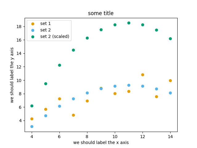
Experiment also by using named colors (e.g. “red”) instead of the hex-codes.
Solution
import matplotlib.pyplot as plt
# this is dataset 1 from
# https://en.wikipedia.org/wiki/Anscombe%27s_quartet
data_x = [10.0, 8.0, 13.0, 9.0, 11.0, 14.0, 6.0, 4.0, 12.0, 7.0, 5.0]
data_y = [8.04, 6.95, 7.58, 8.81, 8.33, 9.96, 7.24, 4.26, 10.84, 4.82, 5.68]
# this is dataset 2
data2_y = [9.14, 8.14, 8.74, 8.77, 9.26, 8.10, 6.13, 3.10, 9.13, 7.26, 4.74]
# here we multiply all elements of data2_y by 2.0
data2_y_scaled = [y * 2.0 for y in data2_y]
fig, ax = plt.subplots()
ax.scatter(x=data_x, y=data_y, c="#E69F00", label="set 1")
ax.scatter(x=data_x, y=data2_y, c="#56B4E9", label="set 2")
ax.scatter(x=data_x, y=data2_y_scaled, c="#009E73", label="set 2 (scaled)")
ax.set_xlabel("we should label the x axis")
ax.set_ylabel("we should label the y axis")
ax.set_title("some title")
ax.legend()
# uncomment the next line if you would like to save the figure to disk
# fig.savefig("exercise-plot.png")
Why these colors?
This qualitative color palette is optimized for all color-vision deficiencies, see https://clauswilke.com/dataviz/color-pitfalls.html and Okabe, M., and K. Ito. 2008. “Color Universal Design (CUD): How to Make Figures and Presentations That Are Friendly to Colorblind People”.
Matplotlib has two different interfaces
When plotting with Matplotlib, it is useful to know and understand that there are two approaches even though the reasons of this dual approach is outside the scope of this lesson.
The more modern option is an object-oriented interface or explicit interface (the
figandaxobjects can be configured separately and passed around to functions):import matplotlib.pyplot as plt # this is dataset 1 from # https://en.wikipedia.org/wiki/Anscombe%27s_quartet data_x = [10.0, 8.0, 13.0, 9.0, 11.0, 14.0, 6.0, 4.0, 12.0, 7.0, 5.0] data_y = [8.04, 6.95, 7.58, 8.81, 8.33, 9.96, 7.24, 4.26, 10.84, 4.82, 5.68] fig, ax = plt.subplots() ax.scatter(x=data_x, y=data_y, c="#E69F00") ax.set_xlabel("we should label the x axis") ax.set_ylabel("we should label the y axis") ax.set_title("some title")
The more traditional option mimics MATLAB plotting and uses the pyplot interface or implicit interface (
pltcarries the global settings):import matplotlib.pyplot as plt # this is dataset 1 from # https://en.wikipedia.org/wiki/Anscombe%27s_quartet data_x = [10.0, 8.0, 13.0, 9.0, 11.0, 14.0, 6.0, 4.0, 12.0, 7.0, 5.0] data_y = [8.04, 6.95, 7.58, 8.81, 8.33, 9.96, 7.24, 4.26, 10.84, 4.82, 5.68] plt.scatter(x=data_x, y=data_y, c="#E69F00") plt.xlabel("we should label the x axis") plt.ylabel("we should label the y axis") plt.title("some title")
When searching for help on the internet, you will find both approaches, they can also be mixed. Although the pyplot interface looks more compact, we recommend to learn and use the object oriented interface.
Why do we emphasize this?
One day you may want to write functions which wrap
around Matplotlib function calls and then you can send Figure and Axes
into these functions and there is less risk that adjusting figures changes
settings also for unrelated figures created in other functions.
When using the pyplot interface, settings are modified for the entire
matplotlib.pyplot package. The latter is acceptable for simple scripts but may yield
surprising results when introducing functions to enhance/abstract Matplotlib
calls.
Styling and customizing plots
Before you customize plots “manually” using a graphical program, please consider how this affects reproducibility.
Try to minimize manual post-processing. This might bite you when you need to regenerate 50 figures one day before submission deadline or regenerate a set of figures after the person who created them left the group.
Matplotlib and also all the other libraries allow to customize almost every aspect of a plot.
It is useful to study Matplotlib parts of a figure so that we know what to search for to customize things.
Matplotlib cheatsheets: https://github.com/matplotlib/cheatsheets
You can also select among pre-defined themes/ style sheets with
use, for instance:plt.style.use('ggplot')
Exercises: Styling and customization
Here are 3 exercises where we try to adapt existing scripts to either tweak how the plot looks (exercises 1 and 2) or to modify the input data (example 3).
This is very close to real life: there are so many options and possibilities and it is almost impossible to remember everything so this strategy is useful to practice:
Select an example that is close to what you have in mind
Being able to adapt it to your needs
Being able to search for help
Being able to understand help request answers (not easy)
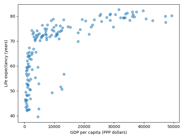
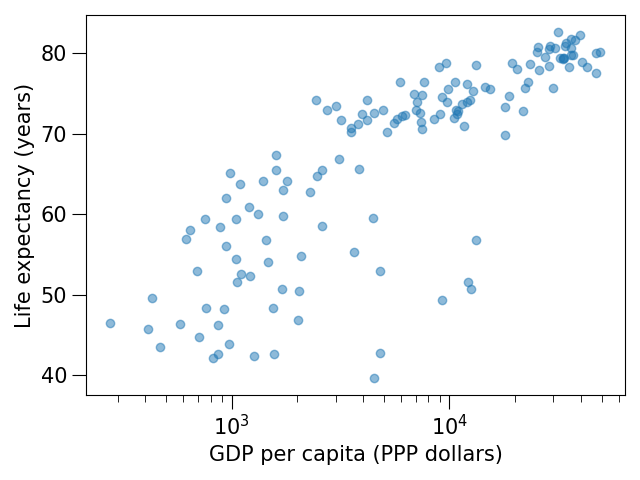
Exercise Customization-1: log scale in Matplotlib (15 min)
In this exercise we will learn how to use log scales.
To demonstrate this we first fetch some data to plot:
import pandas as pd

url = (
    "https://raw.githubusercontent.com/plotly/datasets/master/gapminder_with_codes.csv"
)
gapminder_data = pd.read_csv(url).query("year == 2007")

gapminder_data
Try the above snippet in a notebook and it will give you an overview over the data.
Then we can plot the data, first using a linear scale:
import matplotlib.pyplot as plt

fig, ax = plt.subplots()

ax.scatter(x=gapminder_data["gdpPercap"], y=gapminder_data["lifeExp"], alpha=0.5)

ax.set_xlabel("GDP per capita (PPP dollars)")
ax.set_ylabel("Life expectancy (years)")
This is the result but we realize that a linear scale is not ideal here:
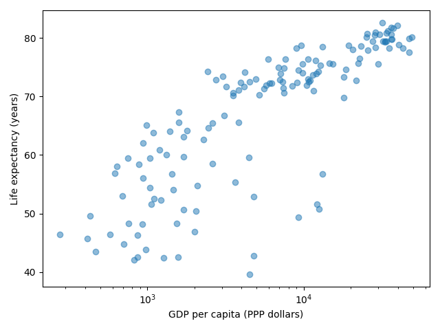
Your task is to switch to a log scale and arrive at this result:
What does
alpha=0.5do?
Solution
See ax.set_xscale().
fig, ax = plt.subplots()

ax.scatter(x=gapminder_data["gdpPercap"], y=gapminder_data["lifeExp"], alpha=0.5)

ax.set_xscale("log")

ax.set_xlabel("GDP per capita (PPP dollars)")
ax.set_ylabel("Life expectancy (years)")
alphasets transparency of points.
Exercise Customization-2: preparing a plot for publication (15 min)
Often we need to create figures for presentation slides and for publications but both have different requirements: for presentation slides you have the whole screen but for a figure in a publication you may only have few centimeters/inches.
For figures that go to print it is good practice to look at them at the size they will be printed in and then often fonts and tickmarks are too small.
Your task is to make the tickmarks and the axis label font larger, using Matplotlib parts of a figure and web search, and to arrive at this:
Solution
See ax.tick_params.
fig, ax = plt.subplots()

ax.scatter(x="gdpPercap", y="lifeExp", alpha=0.5, data=gapminder_data)

ax.set_xscale("log")

ax.set_xlabel("GDP per capita (PPP dollars)", fontsize=15)
ax.set_ylabel("Life expectancy (years)", fontsize=15)

ax.tick_params(which="major", length=10)
ax.tick_params(which="minor", length=5)
ax.tick_params(labelsize=15)
Exercise Customization-3: adapting a gallery example
This is a great exercise which is very close to real life.
Your task is to select one visualization library (some need to be installed first - in doubt choose Matplotlib or Seaborn since they are part of Anaconda installation):
Matplotlib: probably the most standard and most widely used
Seaborn: high-level interface to Matplotlib, statistical functions built in
Vega-Altair: declarative visualization, statistics built in (we have an entire lesson about data visualization using Vega-Altair)
Plotly: interactive graphs
Bokeh: also here good for interactivity
plotnine: implementation of a grammar of graphics in Python, it is based on ggplot2
ggplot: R users will be more at home
PyNGL: used in the weather forecast community
K3D: Jupyter Notebook extension for 3D visualization
Browse the various example galleries (links above).
Select one example that is close to your recent visualization project or simply interests you.
Note that you might need to install additional Python packages in order make use of the libraries. This could be the visualization library itself, and in addition also any required dependency package.
First try to reproduce this example in the Jupyter Notebook.
Then try to print out the data that is used in this example just before the call of the plotting function to learn about its structure. Is it a pandas dataframe? Is it a NumPy array? Is it a dictionary? A list? a list of lists?
Then try to modify the data a bit.
If you have time, try to feed it different, simplified data. This will be key for adapting the examples to your projects.
Example “solution” for such an exploration below.
An example exploration
Let us imagine we were browsing https://seaborn.pydata.org/examples/index.html
And this example plot caught our eye: https://seaborn.pydata.org/examples/simple_violinplots.html
Try to run it in the notebook.
The
dseems to be the data. Right before the call tosns.violinplot, add aprint(d):import numpy as np import seaborn as sns sns.set_theme() # Create a random dataset across several variables rs = np.random.default_rng(0) n, p = 40, 8 d = rs.normal(0, 2, (n, p)) d += np.log(np.arange(1, p + 1)) * -5 + 10 print(d) # Show each distribution with both violins and points sns.violinplot(data=d, palette="light:g", inner="points", orient="h")
The print reveals that
dis a NumPy array and looks like a two-dimensional list:[[10.25146044 6.27005437 5.78778386 3.27832843 0.88147169 1.76439276 2.87844934 1.49695422] [ 8.59252953 4.00342116 3.26038963 3.15118015 -2.69725111 0.60361933 -2.22137264 -1.86174242] ... many more lines ... [12.45950762 4.32352988 6.56724895 3.42215312 0.34419915 0.46123886 -1.56953795 0.95292133]]
Now let’s try with a much simplified two-dimensional list:
# import numpy as np
import seaborn as sns

sns.set_theme()

# # Create a random dataset across several variables
# rs = np.random.default_rng(0)
# n, p = 40, 8
# d = rs.normal(0, 2, (n, p))
# d += np.log(np.arange(1, p + 1)) * -5 + 10

d = [[1.0, 2.0, 2.0, 3.0, 3.0, 3.0],
     [1.0, 1.0, 1.0, 2.0, 2.0, 3.0]]

# Show each distribution with both violins and points
sns.violinplot(data=d, palette="light:g", inner="points", orient="h")
Seems to work! And finally we arrive at a working example with our own data with all the “clutter” removed:
import seaborn as sns

# l1 and l2 are note great names but they will do for a quick test
l1 = [1.0, 2.0, 2.0, 3.0, 3.0, 3.0]
l2 = [1.0, 1.0, 1.0, 2.0, 2.0, 3.0]

sns.violinplot(data=[l1, l2], palette="light:g", inner="points", orient="h")
And now we can focus the rest of our work to read our real data.
Finally we can customize the plot, e.g. web search for “seaborn violin plot axis labels” and add
ax.set_yticklabels(['dataset 1', 'dataset 2']).
Discussion
After the exercises, the group can discuss their findings and it is important to clarify questions at this point before moving on.
Matplotlib and pandas DataFrames
In the above exercises we have sent individual columns of the gapminder_data DataFrame
into ax.scatter() like this:
fig, ax = plt.subplots()

ax.scatter(x=gapminder_data["gdpPercap"], y=gapminder_data["lifeExp"], alpha=0.5)
It is possible to do this instead and let Matplotlib “unpack” the columns:
fig, ax = plt.subplots()

ax.scatter(x="gdpPercap", y="lifeExp", alpha=0.5, data=gapminder_data)
Other input types are possible. See Types of inputs to plotting functions.
Keypoints
Minimize manual post-processing, script everything.
Browse a number of example galleries to help you choose the library that fits best your work/style.
Figures for presentation slides and figures for manuscripts have different requirements.
Think about color-vision deficiencies when choosing colors. Use existing solutions for this problem.