List of exercises
Full list
This is a list of all exercises and solutions in this lesson, mainly as a reference for helpers and instructors. This list is automatically generated from all of the other pages in the lesson. Any single teaching event will probably cover only a subset of these, depending on their interests.
Jupyter
Exercises: Jupyter-1
If you aren’t set up with JupyterLab yet or these things don’t work, use this time to see the installation instructions and ask us any questions you may have.
Start Jupyter in the directory you want to use for this course.
If you are using Miniforge from the command line, you can navigate with
cdto a directory of your choice.If you are starting from the Anaconda Navigator, change to the directory you want to use.
Create a Python 3 notebook file. Save it. In the next section, you will add stuff to it.
(optional, but will be done in future lessons) Explore the file browser, try making some non-notebook text/py/md files and get used to that.
(optional, advanced) Look at the notebook file in a text editor. How does it work?
If everything works for you, this will end very quickly. You can begin reading the next sections independently.
Exercises: Jupyter-2
Run some trivial code, such as
print(1).Run some slightly less trivial code, like print out the first ten Fibonacci numbers.
Make a Markdown cell above your code cell and give it a title and some description of your function. Use the reference to add a heading, bullet list, and some (bold, italic, or inline code)
Use the %%timeit magic function to time your Fibonacci function.
Again using
%%timeit, figure out the fastest way to sum the numbers 0 to 1000000.Once you are done, close your notebooks and other tabs you don’t need. Check the running sessions (hint: thin left sidebar) and shut down these kernels.
Solutions: Jupyter-2
–
Simple fibonacci code
a, b = 0, 1
for i in range(10):
    print(a)
    a, b = b, a+b
Markdown description
# Fibonacci
* Start with two variables `a` and `b`
* Repeat 10 times
    * Print old `a`, then increment both
* Makes use of the Python *tuple assignment*: `a, b = new_a, new_b`
In this case, the print() statements get out of hand, so we comment that out. In general, writing output usually takes a lot of time reletive to the computation, so we don’t want to time that (unless output is the main point of the code, then we do have to time it!
%%timeit
a, b = 0, 1
for i in range(10):
    #print(a)
    a, b = b, a+b
395 ns ± 10.2 ns per loop (mean ± std. dev. of 7 runs, 1000000 loops each)
–
–
Exercises: Jupyter-3
(optional) Discuss the following in groups:
Have any of you used Jupyter in a way that became impossible to maintain: too many files, code all spread out, not able to find your code and run it in the right order. How did you solve that?
On the other hand, what are your successes with Jupyter?
How can you prevent these problems by better development strategies?
NumPy
Exercises: Numpy-1
Datatypes Try out
np.arange(10)andnp.linspace(0,9,10), what is the difference? Can you adjust one to do the same as the other?Datatypes Create a 3x2 array of random float numbers (check
numpy.random.random()) between 0 and 1. Now change the arrays datatype to int (array.astype). How does the array look like?Reshape Create a 3x2 array of random integer numbers between 0 and 10. Change the shape of the array (check
array.reshape) in any way possible. What is not possible?NumPyI/O Save above array to .npy file (
numpy.save()) and read it in again.
Solutions: Numpy-1
Datatypes
np.arange(10)results inarray([0, 1, 2, 3, 4, 5, 6, 7, 8, 9])with dtype int64,while
np.linspace(0,9,10)results inarray([0., 1., 2., 3., 4., 5., 6., 7., 8., 9.])with dtype float64.Both
np.linspaceandnp.arangetake dtype as an argument and can be adjusted to match each other in that way.
Datatypes eg
a = np.random.random((3,2)).a.astype('int')results in an all zero array, not as maybe expected the rounded int (all numbers [0, 1) are cast to 0).Reshape eg
b = np.random.randint(0,10,(3,2)).
b.reshape((6,1))andb.reshape((2,3))possible.It is not possible to reshape to shapes using more or less elements than
b.size = 6, so for exampleb.reshape((12,1))gives an error.
NumPyI/O
np.save('x.npy', b)andx = np.load('x.npy')
Exercises: Numpy-2
Create the following arrays:
# 1-dimensional arrays
x = np.array([1, 10, 100])
# TODO: similar to `x`, create another 1-dimensional array with shape (3,)
# y = np.array(...)

# 2-dimensional arrays
a = np.array([[1, 2], [3, 4]])
# TODO: similar to `a`, create another 2-dimensional array with shape (2, 2)
# b = np.array(...)
Matrix multiplication What is the difference between
numpy.multiplyandnumpy.dot()? Try calling these functions with eitherx, y(1D arrays) ora, b(2D arrays) as input and observe the behaviour.Axis What is the difference between
np.sum(a, axis=1)vsnp.sum(a, axis=0)on a two-dimensional array? What if you leave out the axis parameter?
Solutions: Numpy-2
Matrix multiplication
np.multiplydoes elementwise multiplication on two arrays. The functionnp.dotenables: - dot product and returns a scalar, when both input arrays are 1 dimensional - matrix multiplication and returns back a 2-dimensional array, when both the input arrays are 2 dimensional However,a @ bis preferred overnp.dot(a, b)to express matrix multiplication.Axis
axis=1does the operation (here:np.sum) over each row, while axis=0 does it over each column. If axis is left out, the sum of the full array is given.
Exercise: Numpy-3
a = np.eye(4)
b = a[:, 0]
b[0] = 5
Try out the above code.
How does
alook like beforebhas changed and after?How could it be avoided?
Solution: Numpy-3
View vs copy: The change in b has also changed the array a!
This is because b is merely a view or a shallow copy of a part of array a. Both
variables point to the same memory. Hence, if one is changed, the other
one also changes.
In this example, if you need to keep the original array as is, use
np.copy(a) or np.copy(a[:, 0])
to create a new deep copy of the whole or a slice of array respectively,
before updating b.
See also
NumPy’s documentation on Copies and views
Exercises: Numpy-4
In-place addition: Create an array, add it to itself using a ufunc.
In-place addition (advanced): Create an array of
dtype='float', and an array ofdtype='int'. Try to use the int array as the output argument of the first two arrays.Output arguments and timing Repeat the initial
b = a **
2
example using a ufunc and time it. Can you make it even faster using the output argument?
Solution: Numpy-4
in-place addition:
x = np.array([1, 2, 3])
id(x)                        # get the memory-ID of x
np.add(x, x, out=x)          # Third argument is output array
np.add(x, x, out=x)
print(x)
id(x)                        # get the memory-ID of x
                             # - notice  it is the same
Note that
np.add()writes the result to the output array (out=) and the function returns that same array.Output arguments and timing In this case, on my computer, it was actually slower (this is due to it being such a small array!):
a = np.arange(10_000)
b = np.zeros(10_000)
%%timeit
numpy.square(a, out=b)
This is a good example of why you always need to time things before deciding what is best.
Note: the
_inside numbers is just for human readability and is ignored by python.
Numpy-5
If you have extra time, try these out. These are advanced and optional, and will not be done in most courses.
Reverse a vector. Given a vector, reverse it such that the last element becomes the first, e.g.
[1, 2, 3]=>[3, 2, 1]Create a 2D array with zeros on the borders and 1 inside.
Create a random array with elements [0, 1), then add 10 to all elements in the range [0.2, 0.7).
What is
np.round(0.5)? What isnp.round(1.5)? Why?In addition to
np.round, explorenumpy.ceil,numpy.floor,numpy.trunc. In particular, take note of how they behave with negative numbers.Recall the identity \(\sin^2(x) + \cos^2(x) = 1\). Create a random 4x4 array with values in the range [0, 10). Now test the equality with
numpy.equal. What result do you get withnumpy.allclose()instead ofnp.equal?Create a 1D array with 10 random elements. Sort it.
What’s the difference between
np_array.sort()andnp.sort(np_array)?For the random array in question 8, instead of sorting it, perform an indirect sort. That is, return the list of indices which would index the array in sorted order.
Create a 4x4 array of zeros, and another 4x4 array of ones. Next combine them into a single 8x4 array with the content of the zeros array on top and the ones on the bottom. Finally, do the same, but create a 4x8 array with the zeros on the left and the ones on the right.
NumPy functionality Create two 2D arrays and do matrix multiplication first manually (for loop), then using the np.dot function. Use %%timeit to compare execution times. What is happening?
Solution Numpy-5
One solution is:
a = np.array([1, 2, 3])
a[::-1]
One solution is:
b = np.ones((10,10))
b[:,[0, -1]]=0
b[[0, -1],:]=0
A possible solution is:
x = np.random.rand(100)
y = x + 10*(x >= 0.2)*(x < 0.7)
For values exactly halfway between rounded decimal values, NumPy rounds to the nearest even value.
Let’s test those functions with few negative and positive values:
a = np.array([-3.3, -2.5, -1.5, -0.75, -0.5, 0.5, 0.75, 1.5, 2.5, 3])
np.round(a)  # [-3. -2. -2. -1. -0.  0.  1.  2.  2.  3.]
np.ceil(a)  # [-3. -2. -1. -0. -0.  1.  1.  2.  3.  3.]
np.floor(a)  # [-4. -3. -2. -1. -1.  0.  0.  1.  2.  3.]
np.trunc(a)  # [-3. -2. -1. -0. -0.  0.  0.  1.  2.  3.]
One solution is:
x = 10*np.random.rand(4,4)
oo = np.ones((4,4))
s2c2 = np.square(np.sin(x))+np.square(np.cos(x))
np.equal(oo,s2c2)
np.allclose(oo,s2c2)
Sorting the array itself, without copying it:
x = np.random.rand(10)
x.sort()
NumPy.sort() returns a sorted copy of an array.
np.argsort(x)One solution is:
z = np.zeros((4,4))
o = np.ones((4,4))
np.concatenate((z,o))
np.concatenate((z,o),axis=1)
Using numpy without numpy functionality (np.dot) in this case, is still slow.
Advanced NumPy
Exercises: Numpy-Advanced-1
Write a Python script that uses NumPy to generate 100 million (100000000) random numbers and add them all together. Time how long it takes to execute. Can you beat the C version?
If you are having trouble with this, we recommend completing the basic NumPy lesson before continuing with this advanced lesson. If you are taking a live course - don’t worry, watch and learn and explore some during the exercises!
Solutions: Numpy-Advanced-1
The script can be implemented like this:
import numpy as np
print(np.random.rand(100_000_000).sum())
Exercises: Numpy-Advanced-2
Write a function called ravel() that takes the row and column of an
element in a 2D matrix and produces the appropriate index in an 1D array,
where all the rows are concatenated. See the image above to remind yourself
how each row of the 2D matrix ends up in the 1D array.
The function takes these inputs:
rowThe row of the requested element in the matrix as integer index.
colThe column of the requested element in the matrix as integer index.
n_rowsThe total number of rows of the matrix.
n_colsThe total number of columns of the matrix.
Here are some examples of input and desired output:
ravel(2, 3, n_rows=4, n_cols=4)→11
ravel(2, 3, n_rows=4, n_cols=8)→19
ravel(0, 0, n_rows=1, n_cols=1)→0
ravel(3, 3, n_rows=4, n_cols=4)→15
ravel(3_465, 18_923, n_rows=10_000, n_cols=20_000)→69_318_923
Solutions: Numpy-Advanced-2
The function can be implemented like this:
def ravel(row, col, n_rows, n_cols):
  return row * n_cols + col
Exercises: Numpy-Advanced-3
A little known feature of NumPy is the numpy.stride_tricks module
that allows you to modify the strides attribute directly. Playing
around with this is very educational.
Create your own
transpose()function that will transpose a 2D matrix by reversing itsshapeandstridesattributes usingnumpy.lib.stride_tricks.as_strided().Create a (5 ✕ 100 000 000 000) array containing on the first row all 1’s, the second row all 2’s, and so on. Start with an 1D array
a = np.array([1., 2., 3., 4., 5.])and modify itsshapeandstridesattributes usingnumpy.lib.stride_tricks.as_strided()to obtain the desired 2D matrix:array([[1., 1., 1., ..., 1., 1., 1.], [2., 2., 2., ..., 2., 2., 2.], [3., 3., 3., ..., 3., 3., 3.], [4., 4., 4., ..., 4., 4., 4.], [5., 5., 5., ..., 5., 5., 5.]])
Solutions: Numpy-Advanced-3
The
transpose()function can be implemented like this:from numpy.lib.stride_tricks import as_strided def transpose(a): return as_strided(a, shape=a.shape[::-1], strides=a.strides[::-1]) # Testing the function on a small matrix a = np.array([[1, 2, 3], [4, 5, 6]]) print('Before transpose:') print(a) print('After transpose:') print(transpose(a))
By setting one of the
.stridesto 0, we can repeat a value infinitely many times without using any additional memory:from numpy.lib.stride_tricks import as_strided a = np.array([1., 2., 3., 4., 5.]) as_strided(a, shape=(5, 100_000_000_000), strides=(8, 0))
Pandas
Exploring dataframes
Have a look at the available methods and attributes using the API reference or the autocomplete feature in Jupyter.
Try out a few methods using the Titanic dataset and have a look at the docstrings (help pages) of methods that pique your interest
Compute the mean age of the first 10 passengers by slicing and the
pandas.DataFrame.mean()method(Advanced) Using boolean indexing, compute the survival rate (mean of “Survived” values) among passengers over and under the average age.
Solution
Mean age of the first 10 passengers:
titanic.iloc[:10,:]["Age"].mean()
or:
titanic.loc[:"Nasser, Mrs. Nicholas (Adele Achem)","Age"].mean()
or:
titanic.iloc[:10,4].mean()
Survival rate among passengers over and under average age:
titanic[titanic["Age"] > titanic["Age"].mean()]["Survived"].mean()
and:
titanic[titanic["Age"] < titanic["Age"].mean()]["Survived"].mean()
Analyze the Titanic passenger list dataset
In the Titanic passenger list dataset, investigate the family size of the passengers (i.e. the “SibSp” column).
What different family sizes exist in the passenger list? Hint: try the
unique()methodWhat are the names of the people in the largest family group?
(Advanced) Create histograms showing the distribution of family sizes for passengers split by the fare, i.e. one group of high-fare passengers (where the fare is above average) and one for low-fare passengers (Hint: instead of an existing column name, you can give a lambda function as a parameter to
hist()to compute a value on the fly. For examplelambda x: "Poor" if df["Fare"].loc[x] < df["Fare"].mean() else "Rich").
Solution
Existing family sizes:
titanic["SibSp"].unique()
We get 8 from above. There is no
Namecolumn, since we madeNamethe index when we loaded the dataframe withread_csv, so we usepandas.DataFrame.indexto get the names. So, names of members of largest family(ies):titanic[titanic["SibSp"] == 8].index
Histogram of family size based on fare class:
titanic.hist("SibSp",
             lambda x: "Poor" if titanic["Fare"].loc[x] < titanic["Fare"].mean() else "Rich",
             rwidth=0.9)
Analyze the Nobel prize dataset
What country has received the largest number of Nobel prizes, and how many? How many countries are represented in the dataset? Hint: use the
describemethod on thebornCountryCodecolumn.Create a histogram of the age when the laureates received their Nobel prizes. Hint: follow the above steps we performed for the lifespan.
List all the Nobel laureates from your country.
Now more advanced steps:
Now define an array of 4 countries of your choice and extract only laureates from these countries (you need to look at the data and find how countries are written, and replace
COUNTRYwith those strings):countries = np.array([COUNTRY1, COUNTRY2, COUNTRY3, COUNTRY4]) subset = nobel.loc[nobel['bornCountry'].isin(countries)]Use
groupby()to compute how many nobel prizes each country received in each category. Thesize()method tells us how many rows, hence nobel prizes, are in each group:nobel.groupby(['bornCountry', 'category']).size()(Optional) Create a pivot table to view a spreadsheet like structure, and view it
First add a column “number” to the nobel dataframe containing 1’s (to enable the counting below). We need to make a copy of
subset, because right now it is only a view:subset = subset.copy() subset.loc[:, 'number'] = 1Then create the
pivot_table():table = subset.pivot_table( values="number", index="bornCountry", columns="category", aggfunc="sum" )(Optional) Install the
seabornvisualization library if you don’t already have it, and create a heatmap of your table:import seaborn as sns sns.heatmap(table,linewidths=.5);(Optional) Play around with other nice looking plots:
sns.violinplot(y=subset["year"].dt.year, x="bornCountry", inner="stick", data=subset);sns.swarmplot(y="year", x="bornCountry", data=subset, alpha=.5);subset_physchem = nobel.loc[ nobel['bornCountry'].isin(countries) & ( nobel['category'].isin(['physics']) | nobel['category'].isin(['chemistry']) ) ] sns.catplot( x="bornCountry", y="year", col="category", data=subset_physchem, kind="swarm" );sns.catplot(x="bornCountry", col="category", data=subset_physchem, kind="count");
Solution
Below is solutions for the basic steps, advanced steps are inline above.
We use the describe() method:
nobel.bornCountryCode.describe()
# count     969
# unique     82
# top        US
# freq      292
We see that the US has received the largest number of Nobel prizes, and 82 countries are represented.
To calculate the age at which laureates receive their prize, we need to ensure that the “year” and “born” columns are in datetime format:
nobel["born"] = pd.to_datetime(nobel["born"], errors ='coerce')
nobel["year"] = pd.to_datetime(nobel["year"], format="%Y")
Then we add a column with the age at which Nobel prize was received and plot a histogram:
nobel["age_nobel"] = round((nobel["year"] - nobel["born"]).dt.days / 365, 1)
nobel.hist(column="age_nobel", bins=25, figsize=(8,10), rwidth=0.9)
We can print names of all laureates from a given country, e.g.:
nobel[nobel["country"] == "Sweden"].loc[:, "firstname":"surname"]
Xarray
Exercises: Xarray-1
Download the NARR_19930313_0000.nc dataset have a look at all Data variables. Calculate the geopotential height at x=5148.3726 averaged over y and return the median value. You can use the .plot() method to check on the way whether you use the correct dimensions and indices.
Solutions: Xarray-1
One way of calculating this is:
>>> from pythia_datasets import DATASETS
>>> import xarray as xr
>>>
>>> filepath = DATASETS.fetch('NARR_19930313_0000.nc')
>>> ds = xr.open_dataset(filepath)
>>> ds['Geopotential_height_isobaric'].sel(x=5148.3726).mean('y').median()
<xarray.DataArray 'Geopotential_height_isobaric' ()> Size: 4B
array(4395.487, dtype=float32)
Coordinates:
    x        float32 4B 5.148e+03
Exercises: Xarray-2
Let’s change from climate science to finance for this example. Put the stock prices and trading volumes of three companies in one dataset. Create an Xarray Dataset that uses time and company as dimensions and contains two DataArrays: stock_price and trading_volume. You can download the data as a pandas DataFrame with the following code:
import yfinance as yf

AAPL_df = yf.download("AAPL", start="2020-01-01", end="2024-01-01")
GOOGL_df = yf.download("GOOGL", start="2020-01-01", end="2024-01-01")
MSFT_df = yf.download("MSFT", start="2020-01-01", end="2024-01-01")
As a last thing, add the currency of the stock prices as an attribute to the Dataset.
Solutions: Xarray-2
We can use a script similar to this one:
import xarray as xr
import numpy as np
import yfinance as yf

start_date = "2020-01-01"
end_date = "2024-01-01"

AAPL_df = yf.download("AAPL", start=start_date, end=end_date)
GOOGL_df = yf.download("GOOGL", start=start_date, end=end_date)
MSFT_df = yf.download("MSFT", start=start_date, end=end_date)


stock_prices = np.array(
    [
        AAPL_df["Close"].values,
        GOOGL_df["Close"].values,
        MSFT_df["Close"].values,
    ]
)

trading_volumes = np.array(
    [
        AAPL_df["Volume"].values,
        GOOGL_df["Volume"].values,
        MSFT_df["Volume"].values,
    ]
)


companies = ["AAPL", "GOOGL", "MSFT"]
time = AAPL_df.index[:].strftime("%Y-%m-%d").tolist()

ds = xr.Dataset(
    {
        "stock_price": (["company", "time"], stock_prices[:, :, 0]),
        "trading_volume": (["company", "time"], trading_volumes[:, :, 0]),
    },
    coords={"time": time, "company": companies},
    attrs={"currency": "USD"},
)
Plotting with Matplotlib
Exercise Matplotlib-1: extend the previous example (15 min)
Extend the previous plot by also plotting this set of values but this time using a different color (
#56B4E9):# this is dataset 2 data2_y = [9.14, 8.14, 8.74, 8.77, 9.26, 8.10, 6.13, 3.10, 9.13, 7.26, 4.74]
Then add another color (
#009E73) which plots the second dataset, scaled by 2.0.# here we multiply all elements of data2_y by 2.0 data2_y_scaled = [y * 2.0 for y in data2_y]
Try to add a legend to the plot with
matplotlib.axes.Axes.legend()and searching the web for clues on how to add labels to each dataset. You can also consult this great quick start guide.At the end it should look like this one:

Experiment also by using named colors (e.g. “red”) instead of the hex-codes.
Solution
import matplotlib.pyplot as plt
# this is dataset 1 from
# https://en.wikipedia.org/wiki/Anscombe%27s_quartet
data_x = [10.0, 8.0, 13.0, 9.0, 11.0, 14.0, 6.0, 4.0, 12.0, 7.0, 5.0]
data_y = [8.04, 6.95, 7.58, 8.81, 8.33, 9.96, 7.24, 4.26, 10.84, 4.82, 5.68]
# this is dataset 2
data2_y = [9.14, 8.14, 8.74, 8.77, 9.26, 8.10, 6.13, 3.10, 9.13, 7.26, 4.74]
# here we multiply all elements of data2_y by 2.0
data2_y_scaled = [y * 2.0 for y in data2_y]
fig, ax = plt.subplots()
ax.scatter(x=data_x, y=data_y, c="#E69F00", label="set 1")
ax.scatter(x=data_x, y=data2_y, c="#56B4E9", label="set 2")
ax.scatter(x=data_x, y=data2_y_scaled, c="#009E73", label="set 2 (scaled)")
ax.set_xlabel("we should label the x axis")
ax.set_ylabel("we should label the y axis")
ax.set_title("some title")
ax.legend()
# uncomment the next line if you would like to save the figure to disk
# fig.savefig("exercise-plot.png")
Exercise Customization-1: log scale in Matplotlib (15 min)
In this exercise we will learn how to use log scales.
To demonstrate this we first fetch some data to plot:
import pandas as pd

url = (
    "https://raw.githubusercontent.com/plotly/datasets/master/gapminder_with_codes.csv"
)
gapminder_data = pd.read_csv(url).query("year == 2007")

gapminder_data
Try the above snippet in a notebook and it will give you an overview over the data.
Then we can plot the data, first using a linear scale:
import matplotlib.pyplot as plt

fig, ax = plt.subplots()

ax.scatter(x=gapminder_data["gdpPercap"], y=gapminder_data["lifeExp"], alpha=0.5)

ax.set_xlabel("GDP per capita (PPP dollars)")
ax.set_ylabel("Life expectancy (years)")
This is the result but we realize that a linear scale is not ideal here:

Your task is to switch to a log scale and arrive at this result:

What does
alpha=0.5do?
Solution
See ax.set_xscale().
fig, ax = plt.subplots()

ax.scatter(x=gapminder_data["gdpPercap"], y=gapminder_data["lifeExp"], alpha=0.5)

ax.set_xscale("log")

ax.set_xlabel("GDP per capita (PPP dollars)")
ax.set_ylabel("Life expectancy (years)")
alphasets transparency of points.
Exercise Customization-2: preparing a plot for publication (15 min)
Often we need to create figures for presentation slides and for publications but both have different requirements: for presentation slides you have the whole screen but for a figure in a publication you may only have few centimeters/inches.
For figures that go to print it is good practice to look at them at the size they will be printed in and then often fonts and tickmarks are too small.
Your task is to make the tickmarks and the axis label font larger, using Matplotlib parts of a figure and web search, and to arrive at this:

Solution
See ax.tick_params.
fig, ax = plt.subplots()

ax.scatter(x="gdpPercap", y="lifeExp", alpha=0.5, data=gapminder_data)

ax.set_xscale("log")

ax.set_xlabel("GDP per capita (PPP dollars)", fontsize=15)
ax.set_ylabel("Life expectancy (years)", fontsize=15)

ax.tick_params(which="major", length=10)
ax.tick_params(which="minor", length=5)
ax.tick_params(labelsize=15)
Plotting with Vega-Altair
Plotting-1: Using visual channels to re-arrange plots
Try to reproduce the above plots if they are not already in your notebook.
Above we have plotted the monthly precipitation for two cities side by side using a stacked plot. Try to arrive at the following plot where months are along the y-axis and the precipitation amount is along the x-axis:

Ask the Internet or AI how to change the axis title from “precipitation” to “Precipitation (mm)”.
Modify the temperature range plot to show the temperature ranges for the two cities side by side like this:

Solution
Copy-paste code blocks from above.
Basically we switched x and y:
alt.Chart(data_monthly).mark_bar().encode(
    y="yearmonth(date):T",
    x="precipitation",
    color="name",
    yOffset="name",
)
This can be done with the following modification:
alt.Chart(data_monthly).mark_bar().encode(
    y="yearmonth(date):T",
    x=alt.X("precipitation").title("Precipitation (mm)"),
    color="name",
    yOffset="name",
)
We added one line:
alt.Chart(data_monthly).mark_area(opacity=0.5).encode(
    x="yearmonth(date):T",
    y="max temperature",
    y2="min temperature",
    color="name",
    column="name",
)
Plotting-2: Adapting a gallery example
This is a great exercise which is very close to real life.
Browse the Vega-Altair example gallery.
Select one example that is close to your current/recent visualization project or simply interests you.
First try to reproduce this example, as-is, in the Jupyter Notebook.
If you get the error “ModuleNotFoundError: No module named ‘vega_datasets’”, then try one of these examples: (they do not need the “vega_datasets” module)
Slider cutoff (below you can find a walk-through for this example)
Then try to print out the data that is used in this example just before the call of the plotting function to learn about its structure. Consider writing the data to file before changing it.
Then try to modify the data a bit.
If you have time, try to feed it different, simplified data. This will be key for adapting the examples to your projects.
Working with Data
Exercise
You have a model that you have been training for a while. Lets assume it’s a relatively simple neural network (consisting of a network structure and it’s associated weights).
Let’s consider 2 scenarios
A: You have a different project, that is supposed to take this model, and do some processing with it to determine it’s efficiency after different times of training.
B: You want to publish the model and make it available to others.
What are good options to store the model in each of these scenarios?
Solution
A:
Some export into a binary format that can be easily read. E.g. pickle or a specific export function from the library you use.
It also depends on whether you intend to make the intermediary steps available to others. If you do, you might also want to consider storing structure and weights separately or use a format specific for the type of model you are training to keep the data independent of the library.
B:
You might want to consider a more general format that is supported by many libraries, e.g. ONNX, or a format that is specifically designed for the type of model you are training.
You might also want to consider additionally storing the model in a way that is easily readable by humans, to make it easier for others to understand the model.
Scripts
Scripts-1
Download the
weather_observations.ipynband upload them to your Jupyterlab. The script plots the temperature data for Tapiola in Espoo. The data is originally from rp5.kz and was slightly adjusted for this lecture.Hint: Copy the URL above (right-click) and in JupyterLab, use File → Open from URL → Paste the URL. It will both download it to the directory JupyterLab is in and open it for you.
Open a terminal in Jupyter: File → New Launcher, then click “Terminal” there. (if you do it this way, it will be in the right directory. File → New → Terminal might not be.)
Convert the Jupyter script to a Python script by calling:
$ jupyter nbconvert --to script weather_observations.ipynb
Run the script (note: you may have
python3rather thanpython):$ python weather_observations.py
Scripts-2
Take the Python script (
weather_observations.py) we have written in the preceding exercise and useargparseto specify the input (URL) and output files and allow the start and end dates to be set.Hint: try not to do it all at once, but add one or two arguments, test, then add more, and so on.
Hint: The input and output filenames make sense as positional arguments, since they must always be given. Input is usually first, then output.
Hint: The start and end dates should be optional parameters with the defaults as they are in the current script.
Execute your script for a few different time intervals (e.g. from January 2019 to June 2020, or from May 2020 to October 2020). Also try using this data for Cairo:
https://raw.githubusercontent.com/AaltoSciComp/python-for-scicomp/master/resources/data/scripts/weather_cairo.csv
Solution
import pandas as pd
import argparse

parser = argparse.ArgumentParser()
parser.add_argument("input", type=str, help="Input data file")
parser.add_argument("output", type=str, help="Output plot file")
parser.add_argument("-s", "--start", default="01/01/2019", type=str, help="Start date in DD/MM/YYYY format")
parser.add_argument("-e", "--end", default="16/10/2021", type=str, help="End date in DD/MM/YYYY format")

args = parser.parse_args()

# load the data
weather = pd.read_csv(args.input,comment='#')

# define the start and end time for the plot
start_date=pd.to_datetime(args.start, dayfirst=True)
end_date=pd.to_datetime(args.end, dayfirst=True)

# preprocess the data
weather['Local time'] = pd.to_datetime(weather['Local time'], dayfirst=True)
# select the data
weather = weather[weather['Local time'].between(start_date,end_date)]

# plot the data
import matplotlib.pyplot as plt
# start the figure.
fig, ax = plt.subplots()
ax.plot(weather['Local time'], weather['T'])
# label the axes
ax.set_xlabel("Date of observation")
ax.set_ylabel("Temperature in Celsius")
ax.set_title("Temperature Observations")
# adjust the date labels, so that they look nicer
fig.autofmt_xdate()

# save the figure
fig.savefig(args.output)
Scripts-3
Download the
optionsparser.pyfunction and load it into your working folder in Jupyterlab (Hint: in JupyterLab, File → Open from URL). Modify the previous script to use a config file parser to read all arguments. The config file is passed in as a single argument on the command line (using e.g.argparseorsys.argv) still needs to be read from the command line.Run your script with different config files.
Solution
The modified weather_observations.py script:
#!/usr/bin/env python
# coding: utf-8

import pandas as pd
from optionsparser import get_parameters
import argparse

# Lets start reading our confg file. we'll use argparse to get the config file.
parser = argparse.ArgumentParser()
parser.add_argument('input', type=str,
                    help="Config File name ")
args = parser.parse_args()

# Set optional parameters with default values and required parameter values with their type
defaults = {
           "xlabel"      : "Date of observation",
           "title"       : "Weather Observations",
           "start"       : "01/06/2021",
           "end"         : "01/10/2021",
           "output"      : "weather.png",
           "ylabel"      : "Temperature in Celsius",
           "data_column" : "T",
           }

required = {
           "input"  : str
           }

# now, parse the config file
parameters = get_parameters(args.input, required, defaults)

# load the data
weather = pd.read_csv(parameters.input,comment='#')

# obtain start and end date
start_date=pd.to_datetime(parameters.start, dayfirst=True)
end_date=pd.to_datetime(parameters.end, dayfirst=True)

# Data preprocessing
weather['Local time'] = pd.to_datetime(weather['Local time'], dayfirst=True)
# select the data
weather = weather[weather['Local time'].between(start_date,end_date)]

# Data plotting
import matplotlib.pyplot as plt
# start the figure.
fig, ax = plt.subplots()
ax.plot(weather['Local time'], weather['T'])
# label the axes
ax.set_xlabel("Date of observation")
ax.set_ylabel("Temperature in Celsius")
ax.set_title("Temperature Observations")
# adjust the date labels, so that they look nicer
fig.autofmt_xdate()


# save the figure
fig.savefig(parameters.output)
Profiling
Exercise: Practicing profiling
In this exercise we will use the Scalene profiler to find out where most of the time is spent and most of the memory is used in a given code example.
Please try to go through the exercise in the following steps:
Make sure
scaleneis installed in your environment (if you have followed this course from the start and installed the recommended software environment, then it is).Download Leo Tolstoy’s “War and Peace” from the following link (the text is provided by Project Gutenberg): https://www.gutenberg.org/cache/epub/2600/pg2600.txt (right-click and “save as” to download the file and save it as “book.txt”).
Before you run the profiler, try to predict in which function the code (the example code is below) will spend most of the time and in which function it will use most of the memory.
Save the example code as
example.pyand run thescaleneprofiler on the following code example and browse the generated HTML report to find out where most of the time is spent and where most of the memory is used:$ scalene example.py
Alternatively you can do this (and then open the generated file in a browser):
$ scalene example.py --html > profile.html
You can find an example of the generated HTML report in the solution below.
Does the result match your prediction? Can you explain the results?
Example code (example.py):
"""
The code below reads a text file and counts the number of unique words in it
(case-insensitive).
"""
import re


def count_unique_words1(file_path: str) -> int:
    with open(file_path, "r", encoding="utf-8") as file:
        text = file.read()
    words = re.findall(r"\b\w+\b", text.lower())
    return len(set(words))


def count_unique_words2(file_path: str) -> int:
    unique_words = []
    with open(file_path, "r", encoding="utf-8") as file:
        for line in file:
            words = re.findall(r"\b\w+\b", line.lower())
            for word in words:
                if word not in unique_words:
                    unique_words.append(word)
    return len(unique_words)


def count_unique_words3(file_path: str) -> int:
    unique_words = set()
    with open(file_path, "r", encoding="utf-8") as file:
        for line in file:
            words = re.findall(r"\b\w+\b", line.lower())
            for word in words:
                unique_words.add(word)
    return len(unique_words)


def main():
    # book.txt is downloaded from https://www.gutenberg.org/cache/epub/2600/pg2600.txt
    _result = count_unique_words1("book.txt")
    _result = count_unique_words2("book.txt")
    _result = count_unique_words3("book.txt")


if __name__ == "__main__":
    main()
Solution

Result of the profiling run for the above code example. You can click on the image to make it larger.
Results:
Most time is spent in the
count_unique_words2function.Most memory is used in the
count_unique_words1function.
Explanation:
The
count_unique_words2function is the slowest because it uses a list to store unique words and checks if a word is already in the list before adding it. Checking whether a list contains an element might require traversing the whole list, which is an O(n) operation. As the list grows in size, the lookup time increases with the size of the list.The
count_unique_words1andcount_unique_words3functions are faster because they use a set to store unique words. Checking whether a set contains an element is an O(1) operation.The
count_unique_words1function uses the most memory because it creates a list of all words in the text file and then creates a set from that list.The
count_unique_words3function uses less memory because it traverses the text file line by line instead of reading the whole file into memory.
What we can learn from this exercise:
When processing large files, it can be good to read them line by line or in batches instead of reading the whole file into memory.
It is good to get an overview over standard data structures and their advantages and disadvantages (e.g. adding an element to a list is fast but checking whether it already contains the element can be slow).
SciPy
Exercise
Do the following exercise or read the documentation and understand the relevant functions of SciPy:
Define a function of one variable and using
scipy.integrate.quad
calculate the integral of your function in the
interval [0.0, 4.0]. Then vary the interval and also modify the function and check
whether scipy can integrate it.
Solution
from scipy import integrate

def myfunction(x):
    # you need to define result
    return result

integral = integrate.quad(myfunction, 0.0, 4.0)
print(integral)
quad uses the Fortran library QUADPACK, which one can assume is pretty good. You can also see a whole lot of scientific information about the function on the docs page - including the scientific names of the methods used.
Exercise
Do the following exercise or read the documentation and understand the relevant functions of SciPy:
Use the SciPy sparse matrix functionality to create a random sparse
matrix with a probability of non-zero elements of 0.05 and size 10000
x 10000. The use the SciPy sparse linear algebra support to calculate
the matrix-vector product of the sparse matrix you just created and a
random vector. Use the %timeit macro to measure how long it
takes. Does the optional format argument when you create the
sparse matrix make a difference?
Then, compare to how long it takes if you’d instead first convert the
sparse matrix to a normal NumPy dense array, and use the NumPy dot
method to calculate the matrix-vector product.
Can you figure out a quick rule of thumb when it’s worth using a sparse matrix representation vs. a dense representation?
Solution
The basic code to do the test is:
import numpy
import scipy.sparse

vector = numpy.random.random(10000)
matrix = scipy.sparse.rand(10000, 10000, density=.05, format='csc')

# We time this line
matrix.dot(vector)
From the top of the spare matrix module documentation, we can
see there are a variety of different available sparse matrix types:
bsr, coo, csr, csc, etc. These each represent a
different way of storing the matrices.
It seems that csr and csc are fairly fast. lil and
dok are slow but it says that these are good for creating
matrices with random insertions.
For example, csr takes 7ms, lil 42ms, dok 1600ms, and
converting to a non-sparse array matrix.toarray() and
multiplying takes 64ms on one particular computer.
This code allows us to time the performance at different
densities. It seems that with the csr format, sparse is better
below densities of around .4 to .5:
..code-block:
for density in [.01, .05, .1, .2, .3, .4, .5]:
    matrix = scipy.sparse.rand(10000, 10000, density=density, format='csr')
    time_sparse = timeit.timeit('matrix.dot(vector)', number=10, globals=globals())
    matrix2 = matrix.toarray()
    time_full = timeit.timeit('matrix2.dot(vector)', number=10, globals=globals())
    print(f"{density} {time_sparse:.3f} {time_full:.3f}")
Library ecosystem
Libraries 1.1: Libraries in your work
What libraries do you use in your work? What have you made, which you could have reused from some other source. What have you used from some other source that you wished you had re-created?
Discuss in the collaborative document.
Libraries 1.1
… is there anything to say here?
Libraries 1.2: Evaluating packages
Below are some links to some packages, both public and made by the authors of this lesson. Evaluate them, considering “would I use this in my project?”
some code on webpage in a paper’s footnote
Libraries 1.2
networkx: This seems to be a relatively large, active project using best practices. Probably usable.
I would probably use it if I had to, but would prefer not to.
This (written by one of the authors of this lesson) has no documenting, no community, no best practices, and is very old. Probably not a good idea to try to use it
This project uses best practices, but doesn’t seem to have a big community. It’s probably fine to use, but who knows if it will be maintained 10 years from now. It does have automated tests via Github Actions (
.github/workflowsand the green checks), so the authors have put some work into making it correct.This (also written by one of the authors) looks like it was made for a paper of some sort. It has some minimal documentation, but still is missing many best practices and is clearly not maintained anymore (look at the ancient pull request). Probably not a good idea to use unless you have to.
This project has a pretty website, and some information. But seems to not be using best practices of an open repository, and custom locations which could disappear at any time.
You notice that several of the older projects here were written by one of the authors of this lesson. It goes to show that everyone starts somewhere and improves over time - don’t feel bad if your work isn’t perfect, as long as you keep trying to get better!
Dependency management
Dependencies-1: Discuss dependency management (5 min)
Please discuss and answer via collaborative document the following questions:
How do you install Python packages (libraries) that you use in your work? From PyPI using pip? From other places using pip? Using conda?
How do you track/record the dependencies? Do you write them into a file or README? Into
requirements.txtorenvironment.yml?If you track dependencies in a file, why do you do this?
Have you ever experienced that a project needed a different version of a Python library than the one on your computer? If yes, how did you solve it?
Dependencies-2: Package language detective (5 min)
Think about the following sentences:
Yes, you can install my package with pip from GitHub.
I forgot to specify my channels, so my packages came from the defaults.
I have a Miniforge installation and I use mamba to create my environments.
What hidden information is given in these sentences?
Solution
The package is provided as a pip package. However, it is most likely not uploaded to PyPI as it needs to be installed from a repository.
In this case the person saying the sentence is most likely using Anaconda or Miniconda because these tools use the
defaults-channel as the default channel. They probably meant to install software from conda-forge, but forgot to specify the channel.Miniforge uses conda-forge as the default channel. So unless some other channel has been specified, packages installed with these tools come from conda-forge as well.
Dependencies-3: Create a Python environment (15 min)
Use conda or venv to create the environment presented in the example.
Dependencies-4: Export an environment (15 min)
Export the environment you previously created.
Binder
Binder-1: Discuss better strategies than only code sharing (10 min)
Lea is a PhD student in computational biology and after 2 years of intensive work, she is finally ready to publish her first paper. The code she has used for analyzing her data is available on GitHub but her supervisor who is an advocate of open science told her that sharing code is not sufficient.
Why is it possibly not enough to share “just” your code? What problems can you anticipate 2-5 years from now?
We form small groups (4-5 persons) and discuss in groups. If the workshop is online, each group will join a breakout room. If joining a group is not possible or practical, we use the shared document to discuss this collaboratively.
Each group write a summary (bullet points) of the discussion in the workshop shared document (the link will be provided by your instructors).
Binder-2: Exercise/demo: Make your notebooks reproducible by anyone (15 min)
Instructor demonstrates this. This exercise (and all following) requires git/GitHub knowledge and accounts, which wasn’t a prerequisite of this course. Thus, this is a demo (and might even be too fast for you to type-along). Watch the video if you are reading this later on:
Creates a GitHub repository
Uploads the notebook file
Then we look at the statically rendered version of the notebook on GitHub
Create a
requirements.txtfile which contains:pandas==1.2.3 matplotlib==3.4.2
Commit and push also this file to your notebook repository.
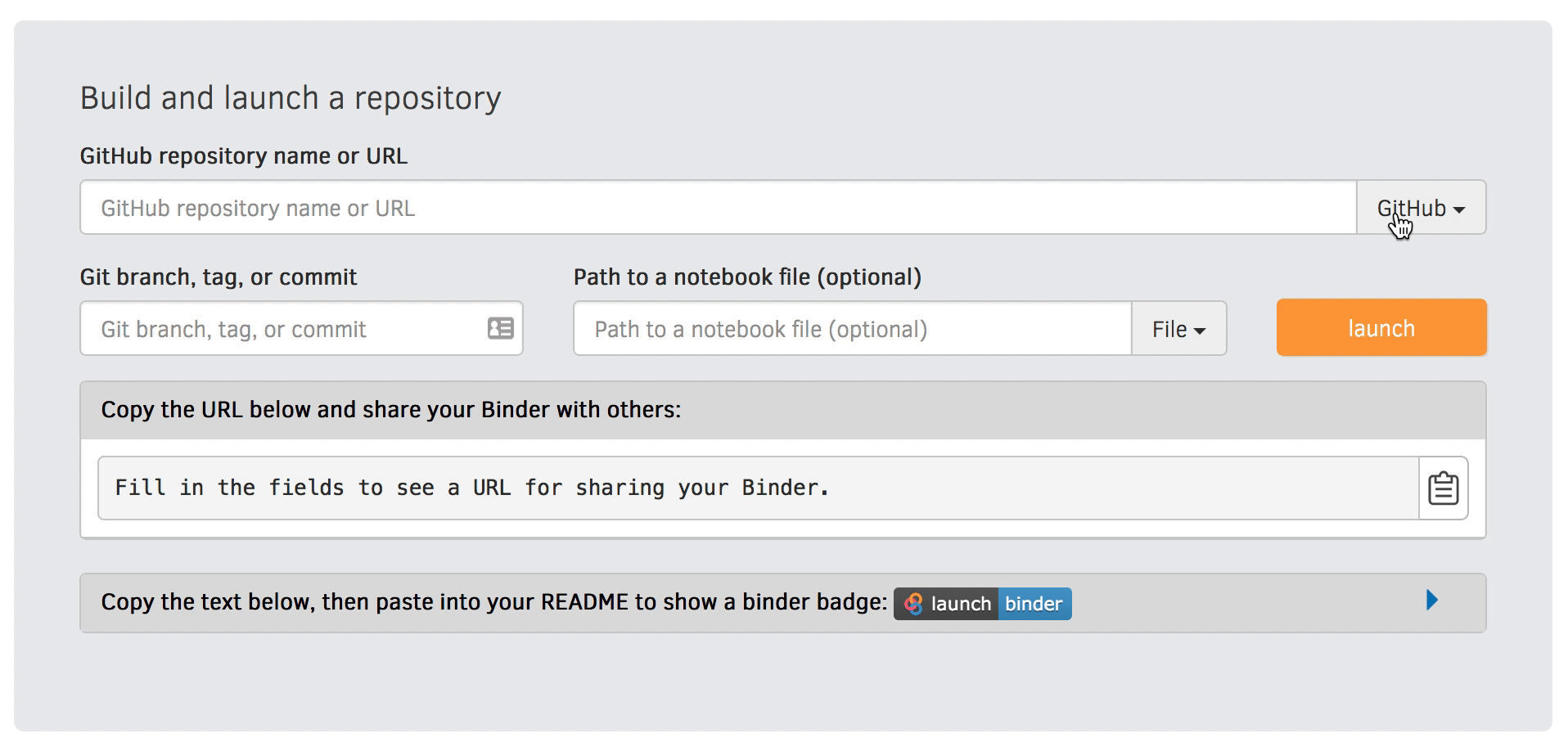
Visit https://mybinder.org and copy paste the code under “Copy the text below …” into your README.md:

Check that your notebook repository now has a “launch binder” badge in your README.md file on GitHub.
Try clicking the button and see how your repository is launched on Binder (can take a minute or two). Your notebooks can now be explored and executed in the cloud.
Enjoy being fully reproducible!
Binder-3: Link a Github repository with Zenodo (optional)
Everything you deposit on Zenodo is meant to be kept (long-term archive). Therefore we recommend to practice with the Zenodo “sandbox” (practice/test area) instead: https://sandbox.zenodo.org
Link GitHub with Zenodo:
Go to https://sandbox.zenodo.org (or to https://zenodo.org for the real upload later, after practicing).
Log in to Zenodo with your GitHub account. Be aware that you may need to authorize Zenodo application (Zenodo will redirect you back to GitHub for Authorization).
Choose the repository webhooks options.
From the drop-down menu next to your email address at the top of the page, select GitHub.
You will be presented with a list of all your Github repositories.
Archiving a repo:
Select a repository you want to archive on Zenodo.
Toggle the “on” button next to the repository ou need to archive.
Click on the Repo that you want to reserve.
Click on Create release button at the top of the page. Zenodo will redirect you back to GitHub’s repo page to generate a release.
Trigger Zenodo to Archive your repository
Go to GitHub and create a release. Zenodo will automatically download a .zip-ball of each new release and register a DOI.
If this is the first release of your code then you should give it a version number of v1.0.0. Add description for your release then click the Publish release button.
Zenodo takes an archive of your GitHub repository each time you create a new Release.
To ensure that everything is working:
Go to https://zenodo.org/account/settings/github/ (or the corresponding sandbox at https://sandbox.zenodo.org/account/settings/github/), or the Upload page (https://zenodo.org/deposit), you will find your repo is listed.
Click on the repo, Zenodo will redirect you to a page that contains a DOI for your repo will the information that you added to the repo.
You can edit the archive on Zenodo and/or publish a new version of your software.
It is recommended that you add a description for your repo and fill in other metadata in the edit page. Instead of editing metadata manually, you can also add a
.zenodo.jsonor aCITATION.cfffile to your repo and Zenodo will infer the metadata from this file.Your code is now published on a Github public repository and archived on Zenodo.
Update the README file in your repository with the newly created zenodo badge.
Binder-4: Link Binder with Zenodo (10 min)
We will be using an existing Zenodo DOI 10.5281/zenodo.3886864 to start Binder:
Go to https://mybinder.org and fill information using Zenodo DOI (as shown on the animation below):
You can also get a Binder badge and update the README file in the repository. It is good practice to add both the Zenodo badge and the corresponding Binder badge.
Parallel programming
Parallel-1, multiprocessing
Here, you find some code which calculates pi by a stochastic
algorithm. You don’t really need to worry how the algorithm works,
but it computes random points in a 1x1 square, and computes the
number that fall into a circle. Copy it into a Jupyter notebook
and use the %%timeit cell magic on the computation part (the
one highlighted line after timeit below):
import random

def sample(n):
    """Make n trials of points in the square.  Return (n, number_in_circle)

    This is our basic function.  By design, it returns everything it\
    needs to compute the final answer: both n (even though it is an input
    argument) and n_inside_circle.  To compute our final answer, all we
    have to do is sum up the n:s and the n_inside_circle:s and do our
    computation"""
    n_inside_circle = 0
    for i in range(n):
        x = random.random()
        y = random.random()
        if x**2 + y**2 < 1.0:
            n_inside_circle += 1
    return n, n_inside_circle

%%timeit
n, n_inside_circle = sample(10**6)

pi = 4.0 * (n_inside_circle / n)
pi
Using the multiprocessing.pool.Pool code from the lesson, run
the sample function 10 times, each with 10**5 samples
only. Combine the results and time the calculation. What is the
difference in time taken?
NOTE: If you’re working in an interactive environment and this
doesn’t work with the multiprocessing module, install and use
the multiprocess module instead!
(optional, advanced) Do the same but with
multiprocessing.pool.ThreadPool instead. This works identically
to Pool, but uses threads instead of different processes.
Compare the time taken.
Solution
See the finished notebook here Python multithreading solution.
You notice the version with ThreadPool is no faster, and
probably takes even longer. This is because this is a
pure-Python function which can not run simultaneously in
multiple threads.
(advanced) Parallel-2 Running on a cluster
How does the pool know how many CPUs to take? What happens if you run on a computer cluster and request only part of the CPUs on a node?
Solution
Pool by default uses one process for each CPU on the node - it doesn’t know about your cluster’s scheduling system. It’s possible that you have permission to use 2 CPUs but it is trying to use 12. This is generally a bad situation, and will just slow you down (and make other users on the same node upset)!
You either need to be able to specify the number of CPUs to use
(and pass it the right number), or make it aware of the cluster
system. For example, on a Slurm cluster you would check the
environment variable SLURM_CPUS_PER_TASK.
Whatever you do, document what your code is doing under the hood, so that other users know what is going on (we’ve learned this from experience…).
Parallel-3, MPI
We can do this as exercise or as demo. Note that this example requires mpi4py and a
MPI installation such as for instance OpenMPI.
Try to run this example on one core:
$ python example.py.Then compare the output with a run on multiple cores (in this case 2):
$ mpiexec -n 2 python example.py.Can you guess what the
comm.gatherfunction does by looking at the print-outs right before and after.Why do we have the if-statement
if rank == 0at the end?Why did we use
_, n_inside_circle = sample(n_task)and notn, n_inside_circle = sample(n_task)?
Solution
We first run the example normally, and get:
$ python example.py
before gather: rank 0, n_inside_circle: 7854305
after gather: rank 0, n_inside_circle: [7854305]

number of darts: 10000000, estimate: 3.141722, time spent: 2.5 seconds
Next we take advantage of the MPI parallelisation and run on 2 cores:
$ mpirun -n 2 python mpi_test.py
before gather: rank 0, n_inside_circle: 3926634
before gather: rank 1, n_inside_circle: 3925910
after gather: rank 1, n_inside_circle: None
after gather: rank 0, n_inside_circle: [3926634, 3925910]

number of darts: 10000000, estimate: 3.1410176, time spent: 1.3 seconds
Note that two MPI processes are now printing output. Also, the parallel version runs twice as fast!
The comm.gather function collects (gathers) values of a
given variable from all MPI ranks onto one root rank, which is
conventionally rank 0.
A conditional if rank == 0 is typically used to print output
(or write data to file, etc) from only one rank.
An underscore _ is often used as a variable name in cases
where the data is unimportant and will not be reused.
Dask-Examples (optional)
Dask examples illustrate the usage of dask and can be run interactively through mybinder. Start an interactive session on mybinder and test/run a few dask examples.
Packaging
Packaging-1
To test a local pip install:
Create a new folder outside of our example project
Create a new virtual environment and activate it (more on this in Dependency management)
Hint
To create and activate a virtual environment
python -m venv .venv
source .venv/bin/activate
which python
python -m venv .venv
.venv\Scripts\activate
where python
Install the example package from the project folder into the new environment:
pip install --editable /path/to/project-folder/Test the local installation:
from calculator import add, subtract, integral

print("2 + 3 =", add(2, 3))
print("2 - 3 =", subtract(2, 3))
integral_x_squared, error = integral(lambda x: x * x, 0.0, 1.0)
print(f"{integral_x_squared = }")
Make a change in the
subtractfunction above such that it always returns a floatreturn float(x - y).Open a new Python console and test the following lines. Compare it with the previous output.
from calculator import subtract

print("2 - 3 =", subtract(2, 3))
The long-version for finding the Create API token page
Log on to test-PyPI at https://test.pypi.org
In the top-right corner, click on the drop-down menu and click Account settings or follow this link.
Scroll down to the section API tokens and click the button Add API token, which opens up the Create API token page.
Web APIs with Python
Exercise WebAPIs-1: Request different activity suggestions from the Bored API
Go to the documentation page of the Bored API. The Bored API is an open API which can be used to randomly generate activity suggestions.
Let’s examine the first sample query on the page http://www.boredapi.com/api/activity/ with a sample JSON response
{
    "activity": "Learn Express.js",
    "accessibility": 0.25,
    "type": "education",
    "participants": 1,
    "price": 0.1,
    "link": "https://expressjs.com/",
    "key": "3943506"
}
Let’s replicate the query and see if we can get another random suggestion.
Exercise WebAPIs-2: Examine request and response headers
Request headers are similar to request parameters but usually define meta information regarding, e.g., content encoding (gzip, utf-8) or user identification (user-agent/user ID/etc., password/access token/etc.).
Let’s first make a request.
Exercise WebAPIs-3: Scrape links from a webpage (Advanced)
Let’s use Requests to get the HTML source code of www.example.com, examine it, and use the Beautiful Soup library to extract links from it. Note: This requires the extra bs4 Python package to be installed, which was not in our initial requirements. Consider this a demo.
Extending Python with Cython
Solution

In depth analysis of some selected file formats
Exercise
Create an arbitrary python object (for example, a string or a list). Pickle it.
Read the pickled object back in and check if it matches the original one.
Solution
import pickle

my_object=['test', 1, 2, 3]

with open('string.pickle', 'wb') as f:
    pickle.dump(my_object, f)


with open('string.pickle', 'rb') as f:
    my_pickled_object = pickle.load(f)

print(my_object, my_pickled_object)
print(my_object == my_pickled_object)
Exercise
Create the example
dataset:import pandas as pd import numpy as np n_rows = 100000 dataset = pd.DataFrame( data={ 'string': np.random.choice(('apple', 'banana', 'carrot'), size=n_rows), 'timestamp': pd.date_range("20130101", periods=n_rows, freq="s"), 'integer': np.random.choice(range(0,10), size=n_rows), 'float': np.random.uniform(size=n_rows), }, )
Save the dataset
datasetas CSV. Load the dataset into a variabledataset_csv.Use
dataset.compare(dataset_csv)to check if loaded dataset matches the original one.
Solution
import pandas as pd
import numpy as np

n_rows = 100000

dataset = pd.DataFrame(
    data={
        'string': np.random.choice(('apple', 'banana', 'carrot'), size=n_rows),
        'timestamp': pd.date_range("20130101", periods=n_rows, freq="s"),
        'integer': np.random.choice(range(0,10), size=n_rows),
        'float': np.random.uniform(size=n_rows),
    },
)
dataset.to_csv('dataset.csv', index=False)
dataset_csv = pd.read_csv('dataset.csv')
print(dataset.compare(dataset_csv))
Dataset might not be completely the same. Sometimes the CSV format cannot fully represent a floating point value, which will result in rounding errors.
Exercise
Create an example numpy array:
n = 1000

data_array = np.random.uniform(size=(n,n))
Store the array as a npy.
Read the dataframe back in and compare it to the original one. Does the data match?
Solution
import numpy as np

n = 1000

data_array = np.random.uniform(size=(n,n))

np.save('data_array.npy', data_array)
data_array_npy = np.load('data_array.npy')
np.all(data_array == data_array_npy)